Telling a story before a single word is spoken.
An exceptional logo isn’t just designed — it’s crafted with purpose. It fuses creativity, precision, and strategy into an icon that’s timeless, unforgettable, and built to last.
An outstanding logo keeps its flow, surging as powerfully and freshly as the day it was unleashed.
Logo created for WanderApp, a Miami based app which allows buyers and sellers of different items to connect via an innovative and interactive blind auction interface
2025

Vienna Residence
Logo redesign for the number one provider for premium serviced apartments in Vienna. The lowercase letters ‘v’ and ‘r’ seamlessly flow into a symbol that resonates like a melody, moving gracefully in a waltz rhythm.
2017


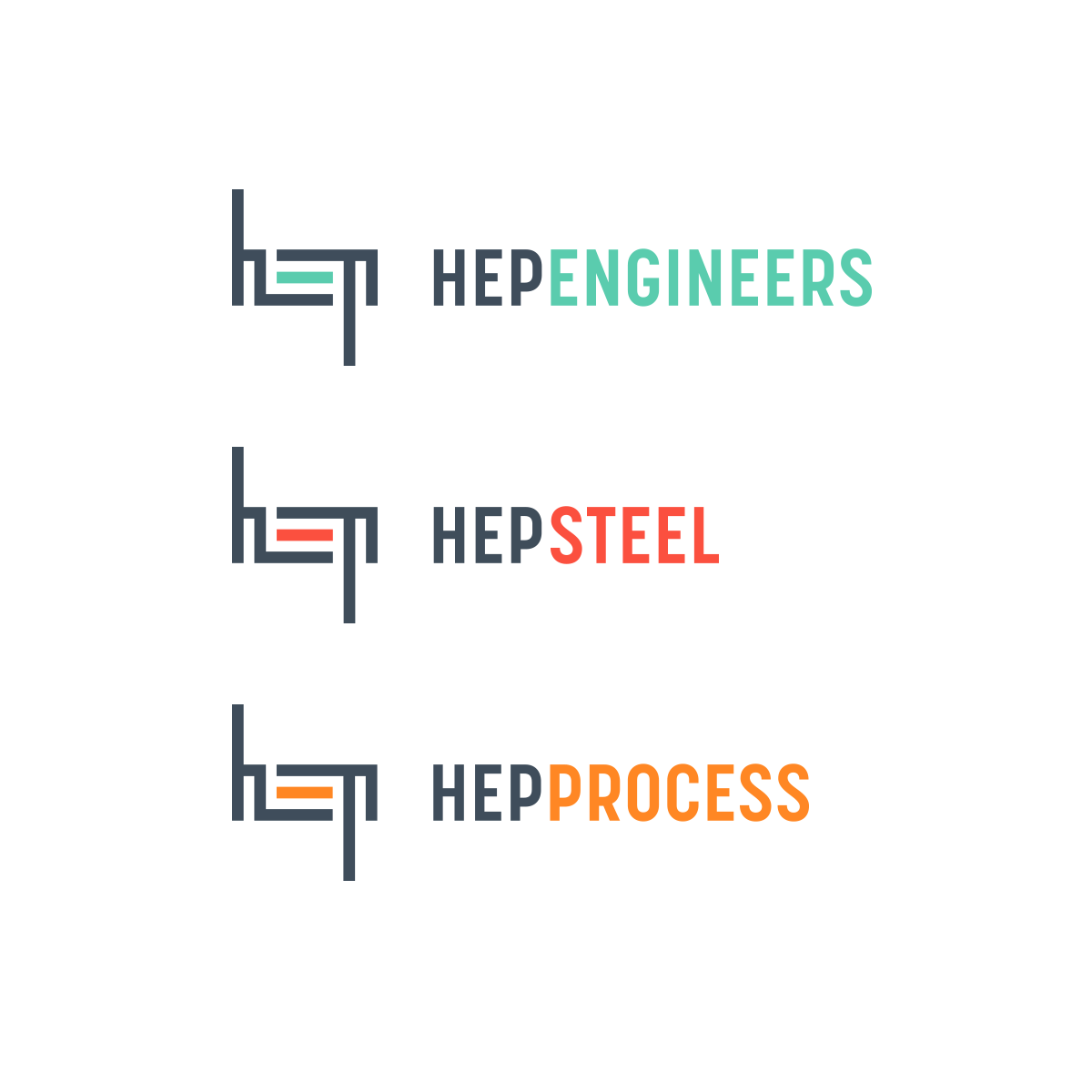
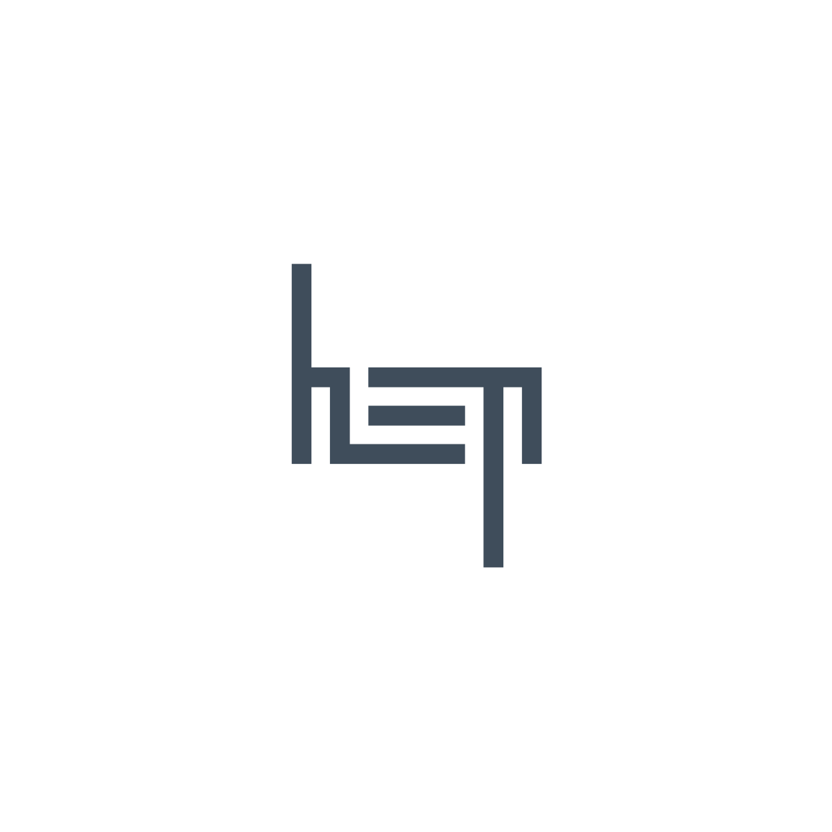
Hepheistos
Visual identity for the industrial brand Hepheistos and its divisions HEP Engineers, HEP Steel, and HEP Process. The shared anatomy of the letters in “HEP” forms a bold, unified symbol—an emblem that stands strong across all brands.
2015

Thomas Hauer
For business consultant Thomas Hauer, the T and H unite into a striking symbol — a bold expression of clarity, confidence, and stability.
2023


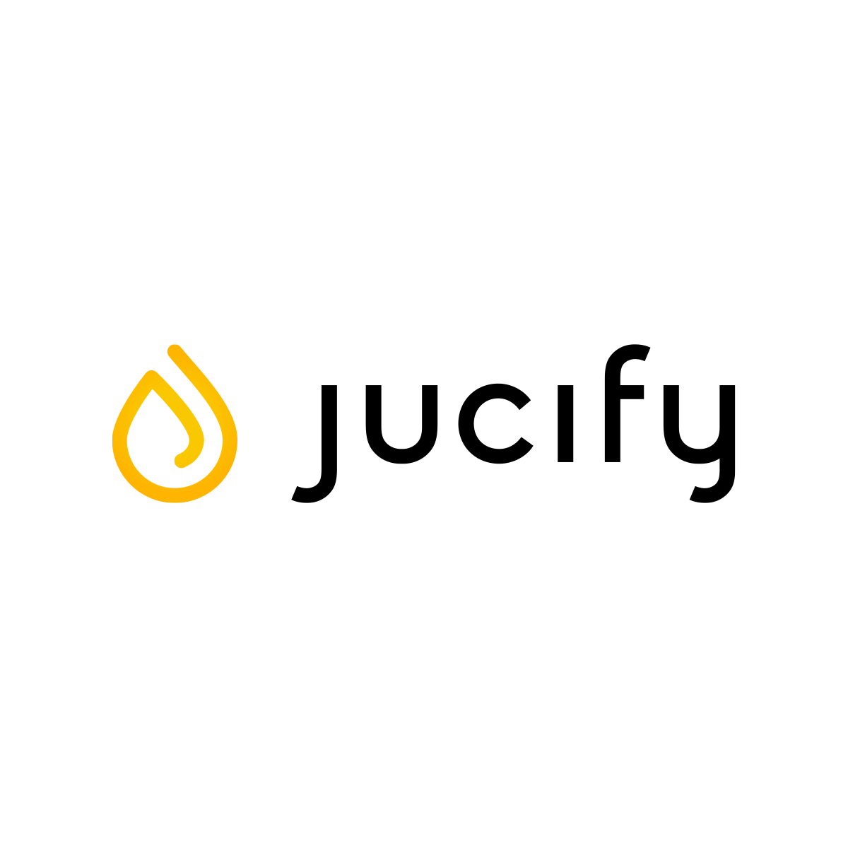
Jucify
Logo for Jucify, a brand, producing premium drinks (juices, cocktails, teas) and high-end beverage machines which allow the user to mix and customize drinks.
2024


Wolfgang Kappl
A logo crafted for the management consultancy Dr. Wolfgang Kappl, where the initials WK and the summation symbol Σ (sigma) unite to embody the firm’s commitment to achieving measurable results.
2017

Juli von CS
Logo design for the alpine fashion house “Juli von CS”, where traditional alpine attire is reinterpreted with contemporary elegance and crafted by hand to preserve and renew heritage with every stitch. A sophisticated typographic style and an infinity symbol subtly formed from the letters “c” and “s” capture the timeless essence of this premium brand.
2016

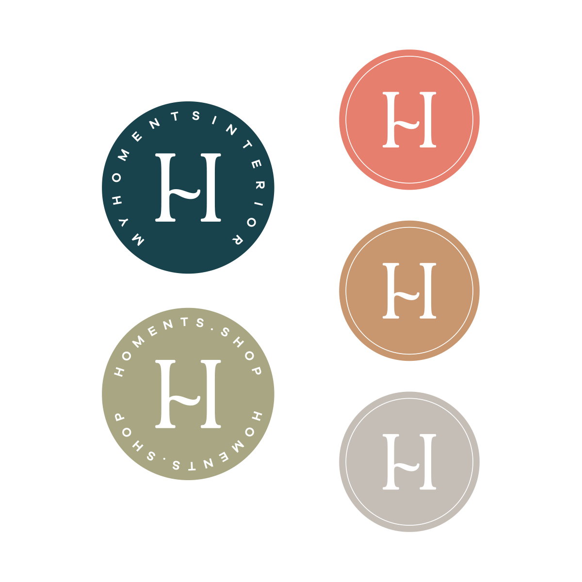
My Homents Interior
Logo for a curated boutique offering regional furniture, refined décor, Portuguese ceramics, and the finest spices. The elegant design is rooted in Vienna — where Biedermeier charm meets modern sophistication.
2023
Woven Rockstar
Logo for Florida-based fashion label Woven Rockstar, specializing in sustainable denim and edgy jeans. The W and R merge into a bold, iconic symbol — evoking a cheering figure or a stylized take on the classic “rock on” hand gesture, capturing the brand’s spirit of celebration and self-expression.
2025


EMI
The Music Store
Logo design for EMI The Music Store, the beloved famous record shop in one of Vienna’s prime inner-city spots. After many drafts, the final logo emerged in a typewriter-style typeface — echoing the warmth and character of a vinyl record’s sound: timeless, textured, and full of soul.
2015
Die Autonauten
Naming and logo design for “Die Autonauten”, an innovative car detailing company, located in Salzburg’s McArthurGlen Design Center.
2015


Pongratz
Logo redesign for Pongratz, Austria’s leading trailer company. The negative space of the P represents the shape of a trailer hitch which cannot be unseen once you know (like the arrow in FedEx).
2016

Zellner Engineering
Logo design for Zellner Engineering. The letters “Z” and “E” merge into an independent, mathematically inspired symbol — combining complexity, simplicity, and logic, mirroring the innovative technical solutions of founder Christoph Zellner.
2022

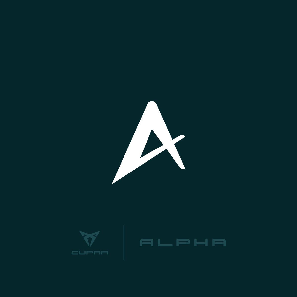
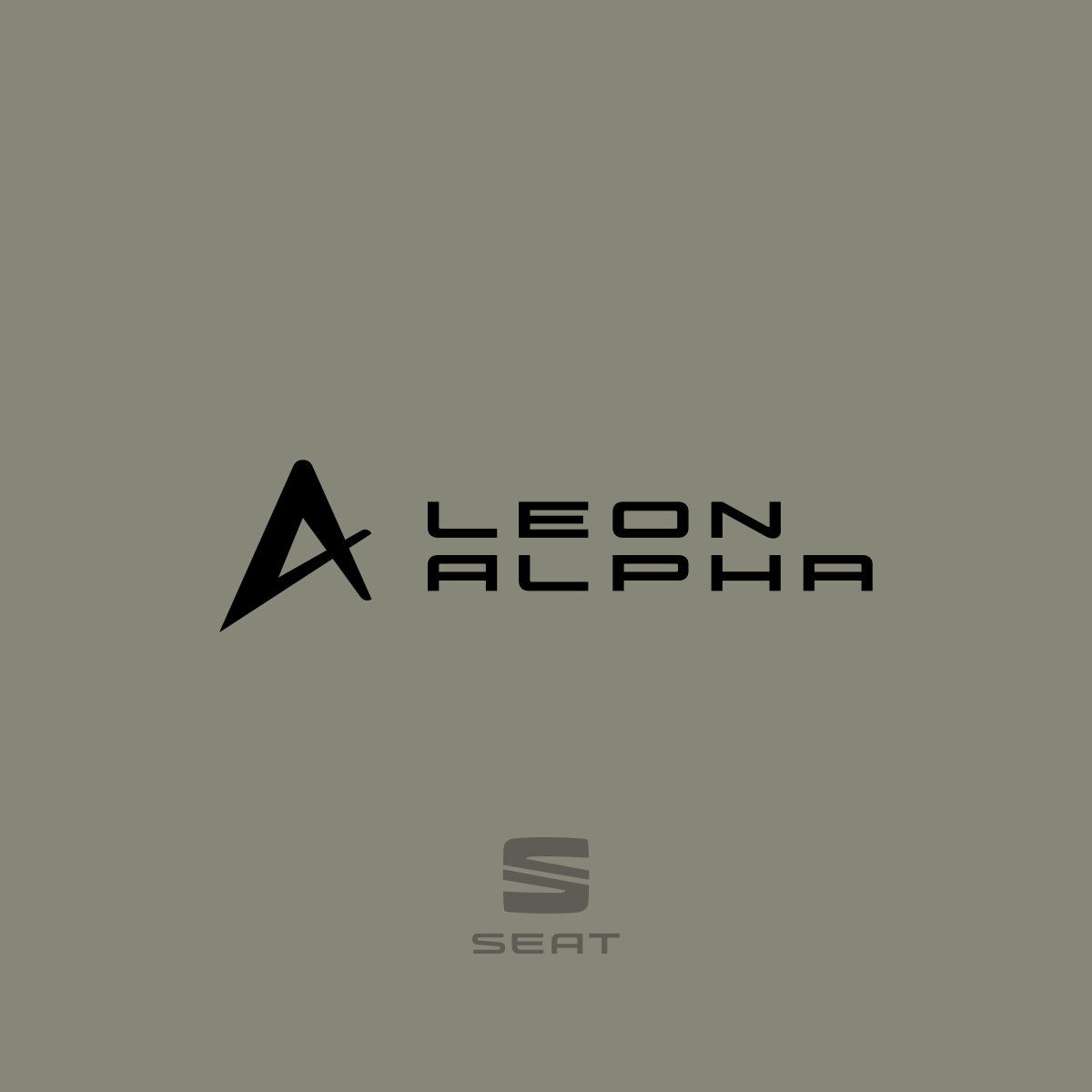
Alpha Edition
Icon for the Alpha Edition of SEAT and CUPRA. The design is based on the shape of the Greek letter Alpha (α), reimagined in a sleek and dynamic form.
2022 / ERLER UND PARTNER


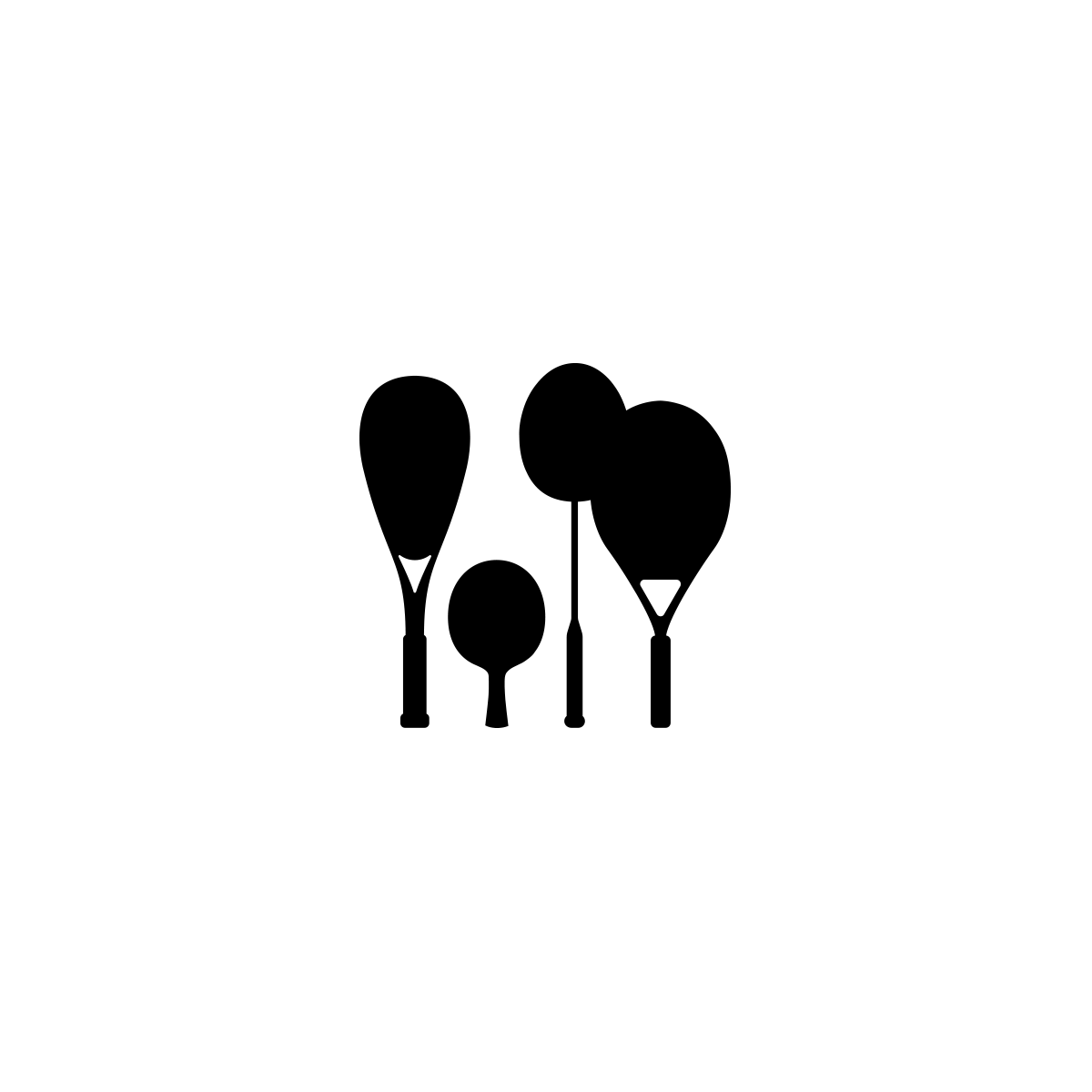
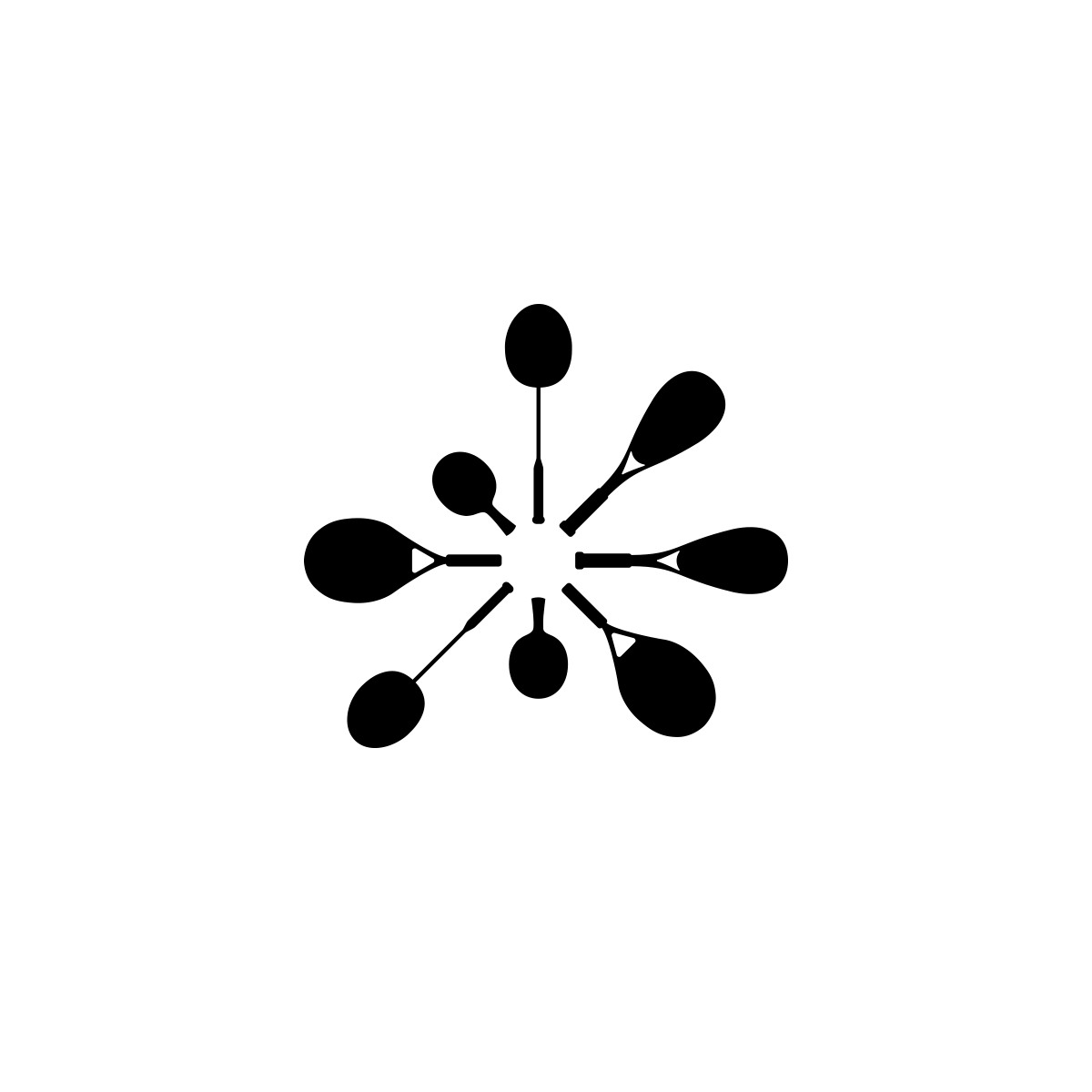
Racketpark
Union Tennisclub
Logos for “Racketpark Bergheim” and the local tennis club “Union TSC”. In Racketpark, rackets grow like trees und for Union TSC, the design transforms rackets into a firework that celebrates the explosive passion of team spirit and tennis culture.
2021 / ERLER UND PARTNER


WIKARUS
Naming and branding for “WIKARUS”, the award of Wirtschafskammer Salzburg for exceptional companies and their achievements and innovations.
2015

IURE
Logo design for the law firm IURE, led by attorney-at-law Franz Scharf. The paragraph symbol is reimagined within a circle — forming an icon of precision, order, and forward motion. A custom-tailored wordmark completes the identity with clarity and strength.
2017


Novogenia
Logo for Novogenia, the Austrian biotech and laboratory company driving innovation in personalized health solutions.
2009

Usergems
Logo design for San Francisco startup UserGems — where AI meets high-value connections. Usergems tracks the most promising buyers and helps companies reach out at just the right moment. The logo? Connections as valuable as a gem.
2016


Erler und Partner
Logo design for Erler und Partner, a communications agency that runs one of Austria’s largest media production studios. At the heart of the bold visual identity: a speech bubble shaped from the initials E and P—symbolizing dialogue, creativity, and connection.
2014


Easy Motus
Logo design for Easy Motus, a massage studio specializing in therapeutic and sports massage. The flowing wave formed from the letters “e” and “m” symbolizes movement, flexibility, and strength — a visual rhythm that captures the essence of healing in motion.
2019

Coffeehouse Bruderhof
Logo for “Coffeehouse” – the café at Salzburg’s Burderhof. The name says it all, and so does the design: a cozy house made of letters, with two coffee beans for O’s, blending warmth and caffeine in one bold mark.
2014 / STEFAN WASCHER
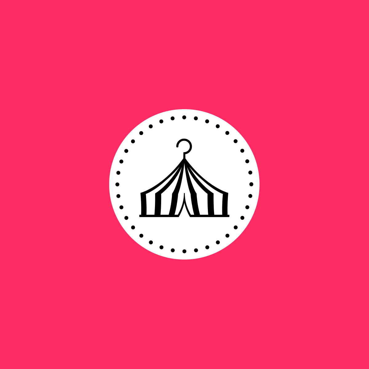
Modezirkus
Logo for Modezirkus (Fashion Circus), a fashion brand with pop-up stores in tents selling avant garde limited edition clothes and one-of-a-kind pieces.
2015

Pink Ideas
Logo for Pink Ideas, a strategic marketing consultancy founded by communications specialist Reingard Meiche.
2018


Detoxcoach
Logo for Detoxcoach, a consultancy focused on natural dietary supplements. A tree— embodying vitality, growth, and inner strength—stands at the heart of the design, reflecting the company’s holistic approach to well-being.
2018


HAK Zell
Logo for the Business Academy (Handelsakademie) Zell am See. A bold “H”, designed in the form of a dynamic “Z”, captures the spirit of innovation and defines the school’s brand language.
2017

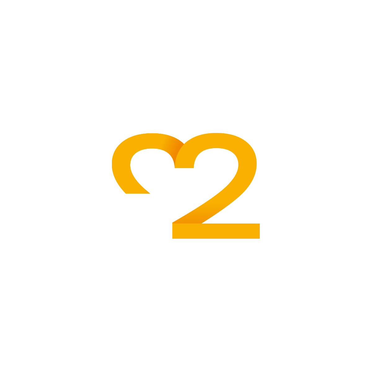
hak:zwei
Redesign for Handelsakademie Zwei (2nd Business Academy) in Salzburg. To give the number “2” a positive meaning, the concept highlights the idea of “doubling”. The logo creatively features a colon as the dot on the “i”, turning it into a dynamic symbol for division, connection, and communication. This playful element is used across sub-brands and throughout the flexible visual identity.
2018

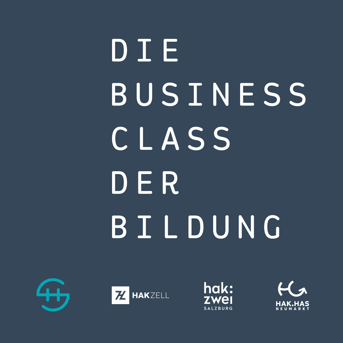
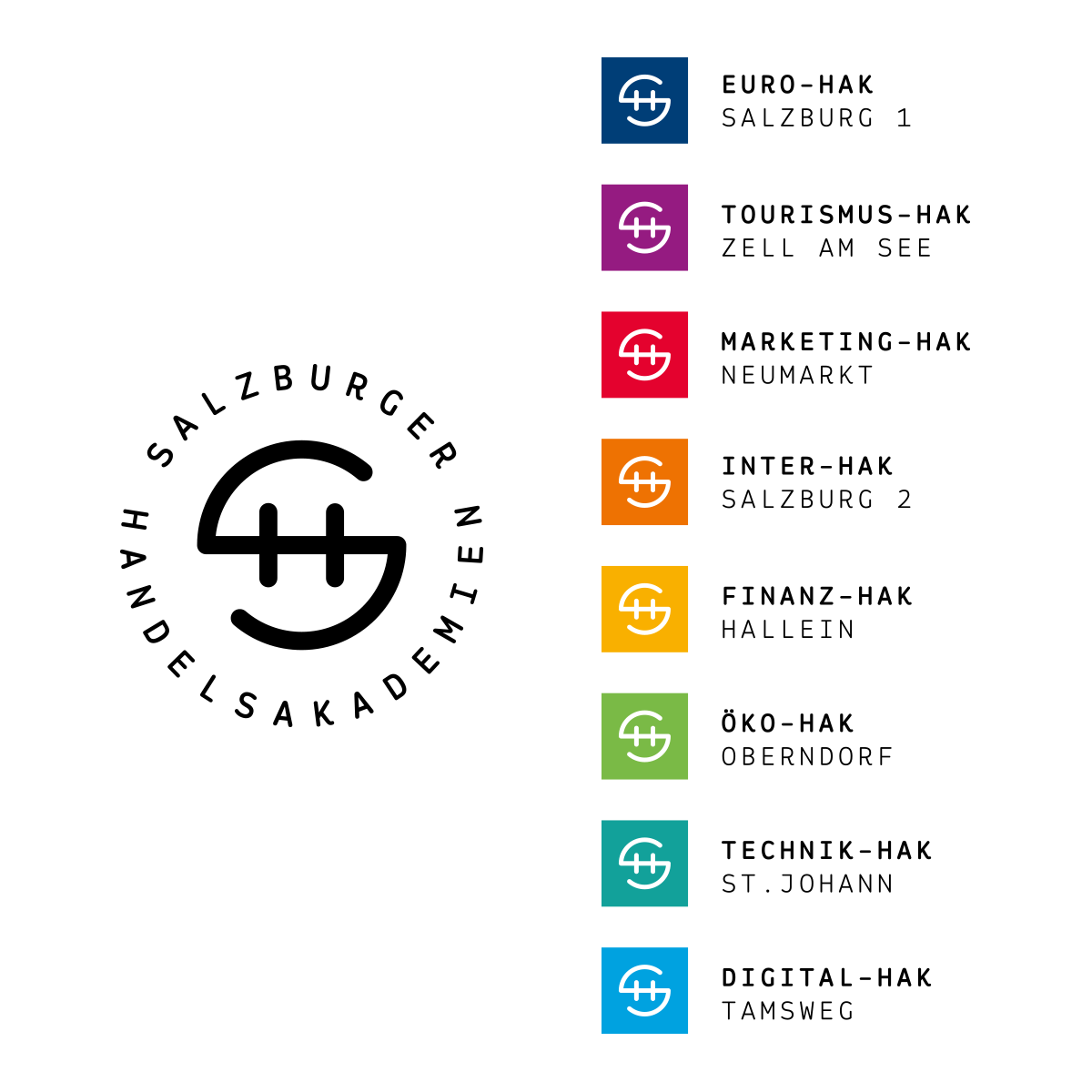
Salzburger Handelsakademien
To strengthen the “HAK” high school model, the umbrella brand Salzburger Handelsakademien was created. The exceptional quality of education is reflected in the slogan “The Business Class of Education”, as well as in the visual identity. The long-term vision—to unite all business academies in Salzburg under a cohesive design while honoring their individual focus—served as the foundation for the concept.
2016
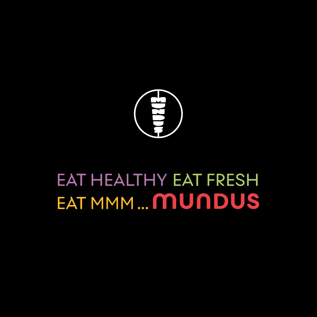
MUNDUS
Redesign of MUNDUS, the Austrian fast food restaurant that combines international cuisine with regional organic products of the highest standards.
2019

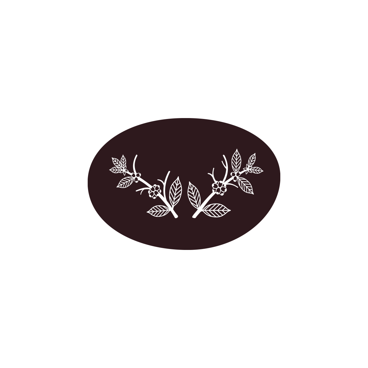
Alpenbohne
Logo for the coffee roastery brand “Alpenbohne”. Branches of a coffee plant are stylized to resemble antlers; paired with rustic typography, the design evokes a look and feel that transforms coffee into an authentically Alpine experience.
2018
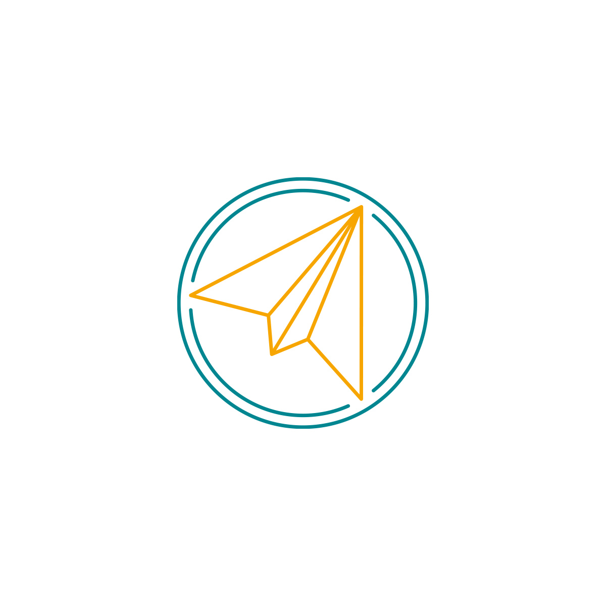
Pilot Of My Life
Logo for pilot Marius Kretschmar’s coaching company, supporting pilots in handling professional stress. A technical paper plane, also resembling a compass needle, is the centerpiece of the brand.
2024

MamaWunsch
Logo for MamaWunsch (“MumWish”), a heartfelt service by Maria Windauer for holistic fertility treatments. A heart-shaped balloon captures the lightness, dreams, and tender emotions that define the journey toward new life.
2018


LieferTaxi
Logo for the brand LieferTaxi, a logistics company specializing in consumer deliveries. The dynamic symbol, crafted from the letters L and T, points in all directions — reflecting speed, flexibility, and the brand’s mission to get things moving wherever they’re needed.
2016
Pinpoll
Logo design for Pinpoll, a startup whose software makes it easy to integrate online surveys and polls into websites. Pinpoll operates across 3 business areas, visually represented by the bar chart in the logo symbol.
2013


VEIBA
Logo design for VEIBA, a forward-thinking IT company dedicated to streamlining and optimizing processes. The symbol visualizes the company’s three core areas, while the custom typography transforms the name into a mirrored palindrome — a perfect balance of logic and design.
2023


Proteein
Logo development for Proteein, an innovative organic black tea protein drink designed for health-conscious athletes, especially in the gym. The design: strong, natural, and masculine, just like the target audience.
2018 / ERLER UND PARTNER
Junge Touristiker Salzburg
Visual identity for the platform supporting young entrepreneurs in the tourism industry in Salzburg. The symbol depicts an abstracted Salzburg landscape with lakes, hills, and mountains.
2005

Christian Fritz
Logo design for business law expert and author of academic publications Prof. Dr. Christian Fritz. The beveled F, which also incorporates a C, serves as the symbol for 3 sub-brands.
2019


PLASTECH
Logo for the industrial holding company PLASTECH, which focuses on plastics in all its forms – from research and development, to production, and recycling. The symbol visualizes the cycle of plastic granules in the shape of a P.
2017

Neunteufel
Logo design for “Neunteufel” (translated: “Ninedevil”), a construction company that wants to stand out on the construction site not only through its quality. What a hell of a lucky opportunity to create a symbol with such a name!
2023

CODEVELOP
Logo for web developer Florian Saria. The name CODEVELOP — a clever fusion of code and develop—lays the foundation for a logo that combines classic programming symbols < > with a play button, symbolizing forward-thinking development and digital momentum.
2016


ALPINE
Logo facelift/redesign for ALPINE, once among Austria’s top three construction companies between 1965 and 2013, with 16,000 employees and a yearly turnover of € 3.5 billion.
2008

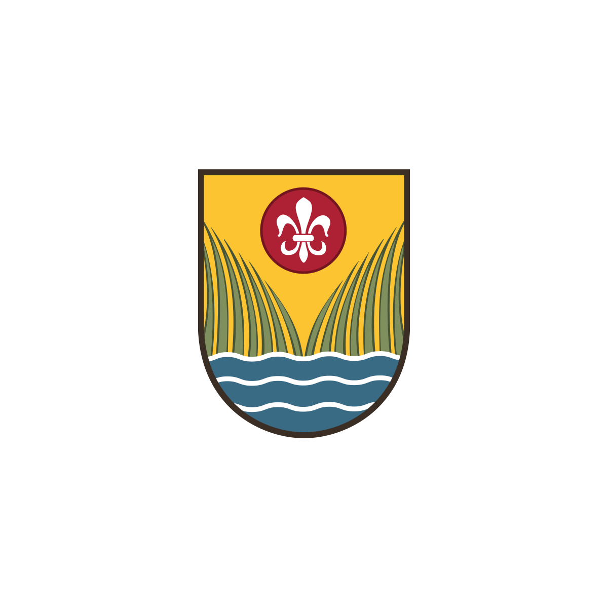
Zell am Moos
Logo redesign for the village of Zell am Moos and development of the slogan “Leben am Irrsee” (“Feeling alive at Lake Irrsee”) for the 900-year anniversary. The coat of arms was subtly modernized, while the typography highlights the charm and quality of life in this scenic Salzkammergut community.
2007

Schulzentrum Neumarkt
Umbrella brand for “Schulzentrum Neumarkt” developed to serve as a wayfinding system within the campus. The three letters — S, Z, and N — share a single geometric form; only the direction they face reveals their identity. A clever visual concept that reflects structure, clarity, and cohesion across the area.
2019

PallioCare
Logo design for PallioCare, a Swiss healthcare provider dedicated to supporting individuals in the palliative stage of life.
2017


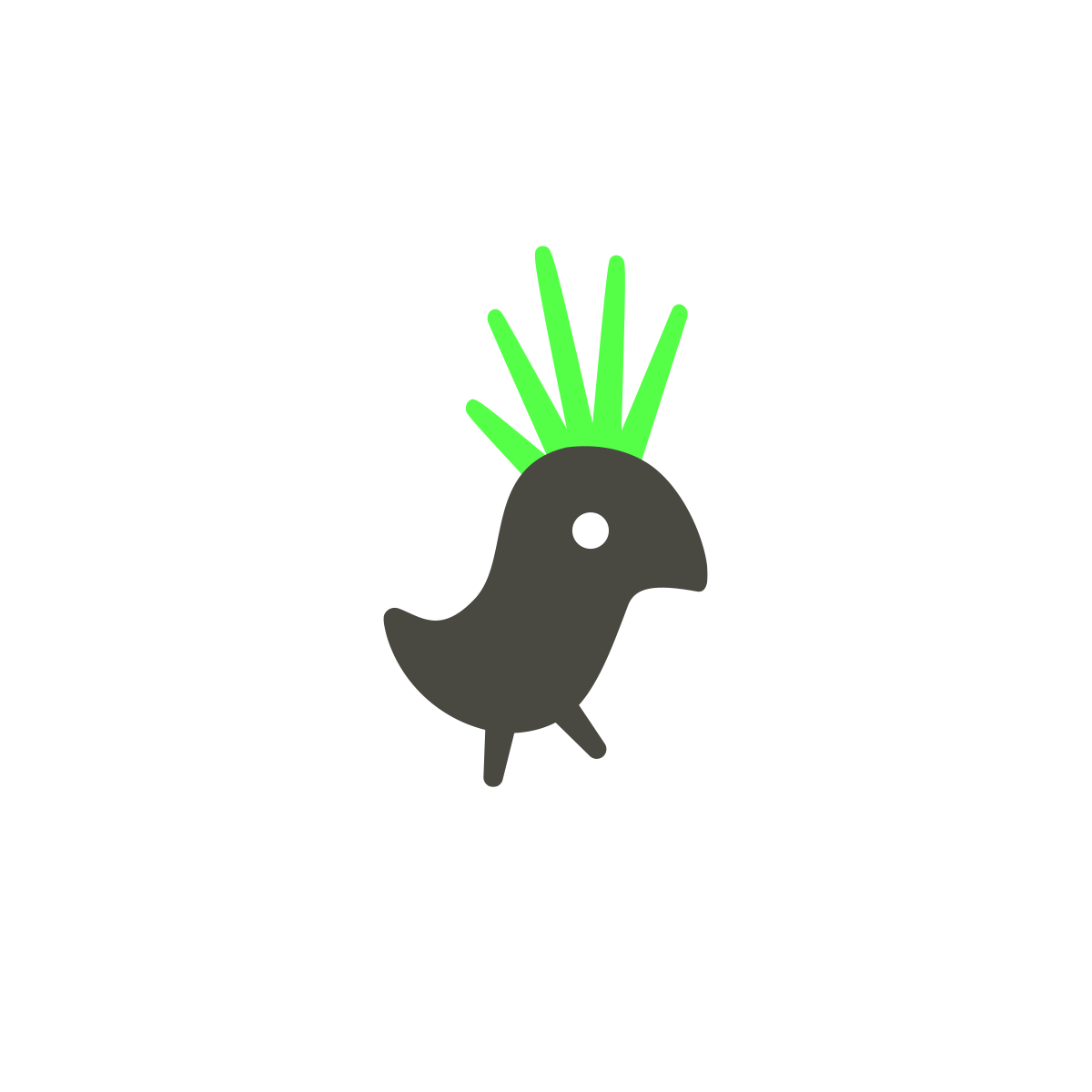
GREEN PUNK
Logo design for the sustainable fashion brand “Green Punk.” A bold visual identity to match the name — featuring heavy typography, neon green, and a cockatoo as its symbol: the ultimate punk of the animal kingdom. With its cheeky appearance, it perfectly unites rebellion and nature like no other creature.
2021


Salzburg24
Logo redesign for the online news portal Salzburg24. The goal was to sharpen the brand’s visual identity and optimize it for digital use.
2013 / WUGER


DORIDA
Logo design for DORIDA, a company that closes gaps in the banking and insurance industries through a modular approach — from IT audits and regulatory compliance to interim management.
2020

Martina Behr
Logo for family and social therapist Martina Behr. The initials “M” and “B” are thoughtfully crafted to come together as a heart, symbolizing care, connection, and empathy at the core of her work.
2021


Bodi End Sole
Evolution of the logo for Theater Bodi End Sole, as part of a generational shift in the leadership. The shadow figures were carefully refined, and the new bold typography complements them with matching edges and character.
2024

Gramai Alm
Logo designs for Adi Rieser’s two connected hospitality brands: the alpine resort “Gramai Alm” and the charming bed and breakfast “Achensee Frühstückspension” in Tyrol.
2016

Begalom
Logo design for Begalom, a global leader in mold making and aluminum casting for automotive components, plant engineering, and motorsport.
2016

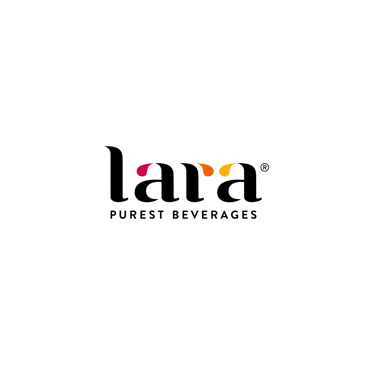
Lara
Logo for the international brand Lara, a driving force of innovation in the B2B fruit juice concentrate industry.
2016

Group Fleet
Logo for the fleet management division of Porsche Holding — a part of the Volkswagen Group that serves corporate clients.
2023 / ERLER UND PARTNER

Isabella
Redesign of the brand logo for spiritual coach Isabella Feichtner.
2025


Holoprävent
Logo for Holoprävent, the practice for micronutrients and holopathy founded by Claudia Zellner. An open yet self-contained form — reminiscent of a lotus flower, water lily, butterflies, or flames — forms the core of the visual identity.
2017


2GETHER
Logo Design for 2GETHER, a social media platform from the year 2000 (that was essentially a pioneer of Facebook, Instagram, and Twitter), which was was the final project at our highschool by Stephan and Christian Kletzl (coding), Carina Mühlfellner (organization), and myself (design).
2000

HAK.HAS Neumarkt
Logo for HAK.HAS Neumarkt, a school for students from 9th to 14th grade.
A very personal milestone: As a student myself, I was entrusted with designing one of my very first logos here. The principal’s wish was clear — a logo that would embody ascent, ambition, and the limitless possibilities ahead. Now, over two decades later, this logo feels just as fitting for aviation: boarding, ascending, taking off … a symbol as a reminder that stepping into school can feel like stepping onto a runway for the journey ahead.
2001